

Personalizing Your Graphics


Branding your substack and making it unique to yourself and who you are on Substack is part of what makes Substack fun—and if you’re creating a presence on Substack for your business, it’s also part of how you can create a cohesive look between your Substack and the rest of your online presence.
Substack has six possible graphics, plus the graphics you choose for each of your posts (don’t underestimate these post graphics, they play the biggest role in creating a cohesive look for your homepage—more on this later).
Profile Graphics
The graphics for your profile are found when you click the “Edit profile” button. First there is the basic profile picture, which you may have set up when you first your Substack account (if your profile picture is still a “substack circle” you haven’t set this up yet)
It’s important to remember that this profile picture is tied to you personally: the comments you make, the notes you post, and you as an author and owner of your own Substack publication. The profile picture is not part of your publication—it is you.
This graphic should be square, at least 256 px by 256 px and preferably a close up head shot—it shows up so small on your substack and as a byline photo, you want to make sure others can see it.
Also in the profile is your cover photo. This option was added in July 2025. If you already had a publication set up, Substack used your welcome page image for this image, which may not be the best fit so you want to check this in your profile settings. this graphic should be a 3 to 1 ratio, which means a 1200px by 400px graphic works well.
Publication Graphics
There are four publication graphics, two of which are necessary and two of which are optional but help a lot with branding.
Logo - at least 256 by 256 px, this graphic should be perfectly square. If it is, it will replace the Substack logo on your browser tab, with your personal logo. This logo is incredibly small, so don’t make it too detailed. It can be a png, jpg or gif. But if you’re using a custom background colour, you’ll need to make your logo to match, since you can’t use a logo with a transparent background, it will fill in white instead.
Welcome page Image - I often refer to this as a “First Impressions Page” since this is the first page your potential subscribers will see. This image has a lot of flexibility once you’ve met the minimum 600 by 600 px requirement. It can be a larger image, a banner, and it can be a jpg, png (with or without a transparent background), or a gif.
Wordmark - (optional) This is the pickiest graphic on Substack, and if you’re struggling to get yours to fit right, you’re not alone. For the best sizing results you want this to be text only, a png with a transparent background, and 1344 by 256 px. You will be able to use a jpg, a png without a transparent background or a gif. You can also include a graphic, as many people do, but they may not always be the size you’re hoping for.
Email banner - This graphic is only seen in your emails (just like your headers and footers). It can help with creating a branded look between your website, your substack and the emails that are sent out to your subscribers from your substack. If you decide to do an email banner (totally optional), this image needs to be 1100 by 220 px.
Post Graphics and Thumbnails
These are arguably the most important images on your substack. It is completely optional to put images in your posts, but for most of us, this is really important.
If you are trying to attract new subscribers, creating evergreen content, serializing your book, writing articles or essays you hope people will read months or even years from now, and/or creating thematic content your post thumbnails are really important.
If you are a news, politics, or investment publication where the only important post is your most recent one, or maybe the most recent 5 posts, this may not matter at all.
You can put as many images as you like in the post itself, and they can any size you want. However, you may want to put a little more effort into your post thumbnail. This is the image in the “Social Preview” section of your Post settings, and Substack will automatically use the first image from your post. Here are a few tips to get the most out of this image:
The best size is a 2:3 ratio, so 400px tall by 600 px wide works well. If the first image in your post is not this ratio, then Substack will auto-crop your image. You may want to crop the image on your own, using canva or another art/photo program and then upload a specific thumbnail to this spot.
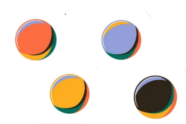
You can also create a themed or branded image for your post. This creates a cohesive, branded look for your Substack and makes your posts recognizable when they show up in your subscribers Substack app feed. I do this with all of my posts. This is especially great if you’re creating a series or a book serialization on your substack. Here are a few examples for you:
This is not to say you have to create images that are the same, but at least think about graphics that go nicely, and create an overall picture of your site. Here are a few examples, which are each very different but within them, you feel like you’ve arrived at a specific place on the internet, not a random collection of articles. This often happens naturally as we’re drawn to a specific look or photo style that we love.
Once again, this graphic can be a jpg, a png (with or without a transparent background) or a gif.
If you’re creating a video post, this graphic will automatically be the thumbnail of your video, unless you change it in the Social Preview.

And that is it for graphics on Substack. If you have any questions, feel free to leave a comment. I will have a video tutorial on creating gif graphics coming out next week.
Thank you so much for the shoutout!My image brand is definitely evolving. I am leaning into older images vs AI illustrations as they do so much better. I’ve even tried my hand at (badly) drawing a couple illustration when inspired.
Color definitely helps give it a family resemblance.